
Overview
Joona is a digital health companion app for individuals and families to securely track, organise, and store their health information in one place.
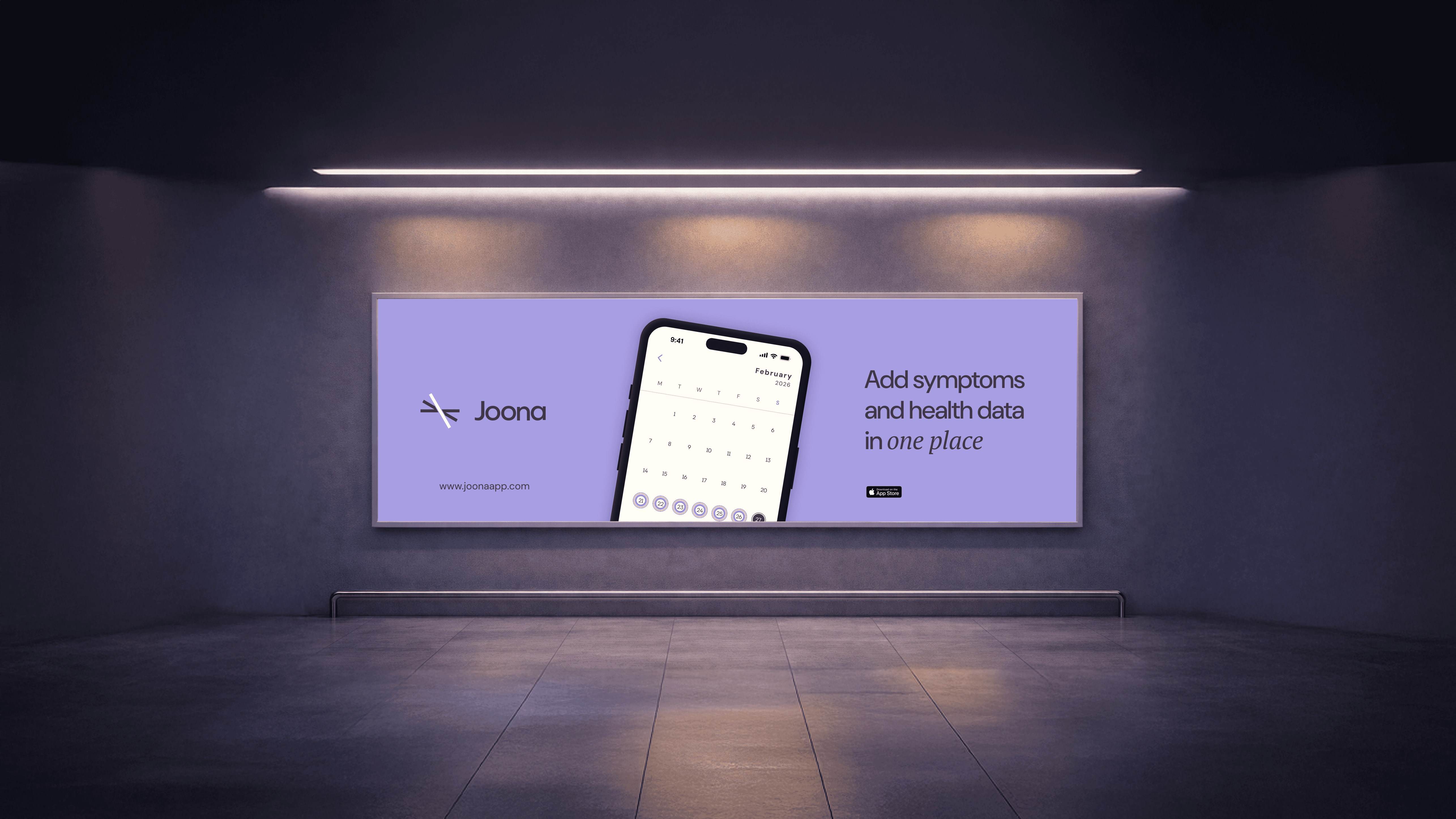
Joona: product in context
The challenge
Health information is scattered across apps, paper records, and different providers. Most people have no single place to see it clearly.
Joona's job was to create a digital-first platform that's simple, trustworthy, and built to handle sensitive personal data well.
The product needed to:
- Consolidate all health information in one place
- Support multiple profiles, including family members
- Communicate data security and privacy without burying it in legal text
- Scale to cover emergency QR codes, premium tracking, and more
Privacy, independence, and user control were the core of everything in this space.
Design approach
I treated Joona as a design-first health companion. The strategy was about cutting complexity, building trust, and giving users real control over their personal data, not just the feeling of it.
Simplifying complexity
Complex medical information was translated into clear visual structures: readable, scannable, and useful for everyday people, not just patients.
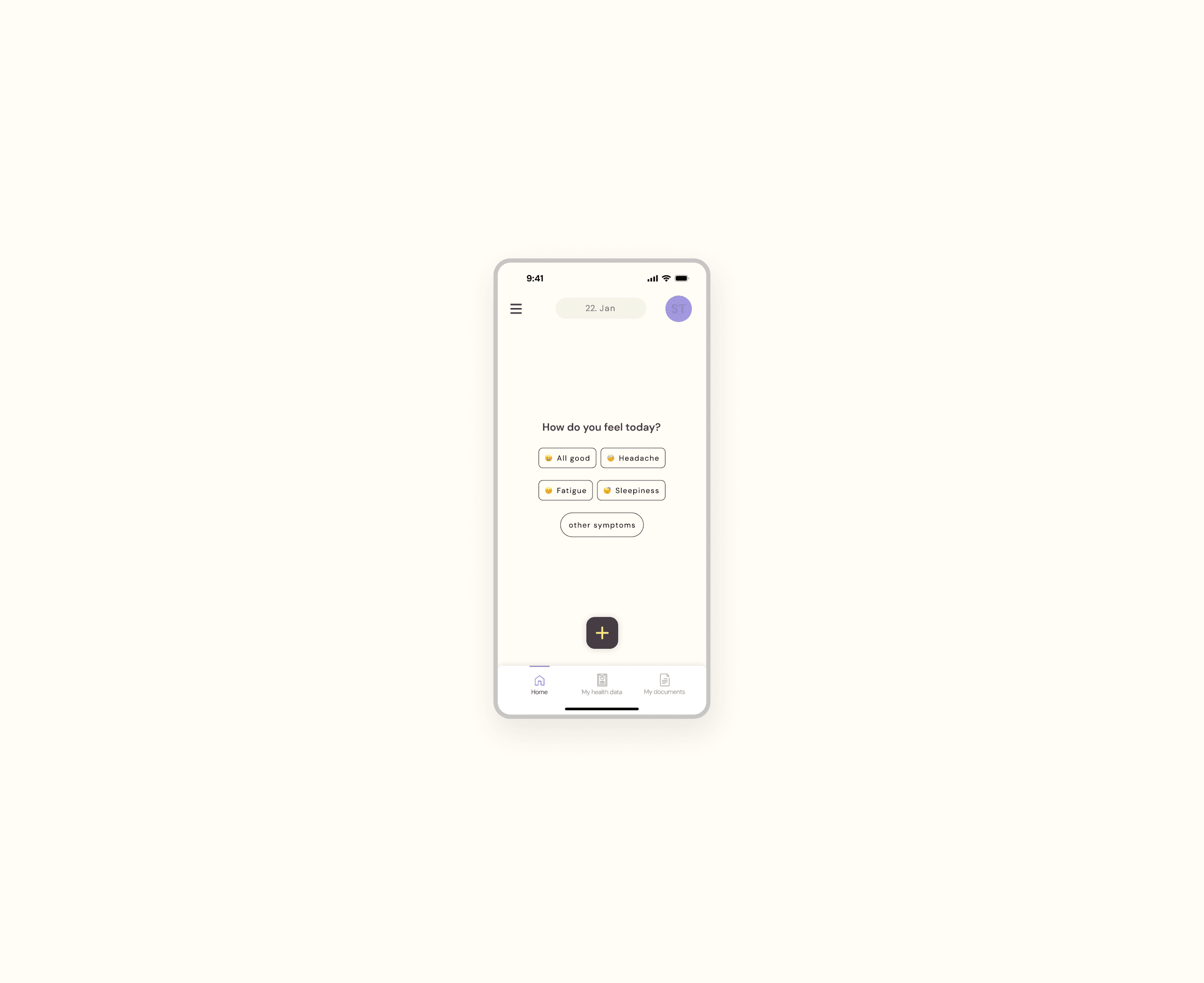
Home screen: a calm, focused daily check-in
Multi-profile and flexible system
The interface supports multiple profiles within a single account, so families can manage health records for different members without things getting tangled.
Every key flow (onboarding, data logging, document storage, health history) was designed to work across all profile types: individual adults, parents tracking children, and everything in between.
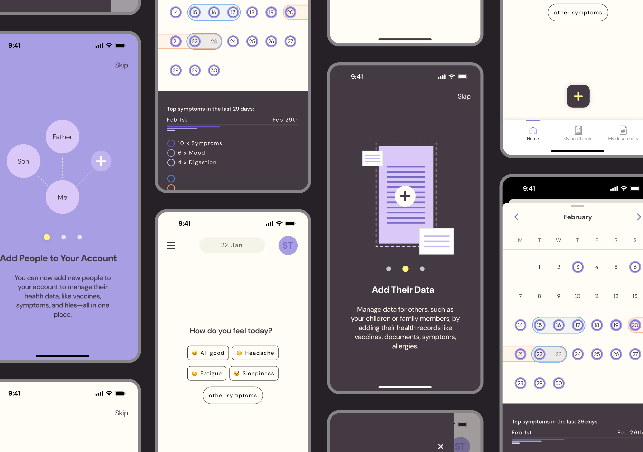
App screens: onboarding, multi-profile, and health tracking flows
Security as a design feature
Instead of treating encryption and data security as technical footnotes, I made them visible. Clear language, intentional UI patterns, and transparent privacy communication turned security into something users could actually see and trust.
Brand identity
Alongside the app, I defined Joona's brand: honest, innovative, and human. The visual identity balances warmth with clinical clarity so it feels approachable without losing credibility.
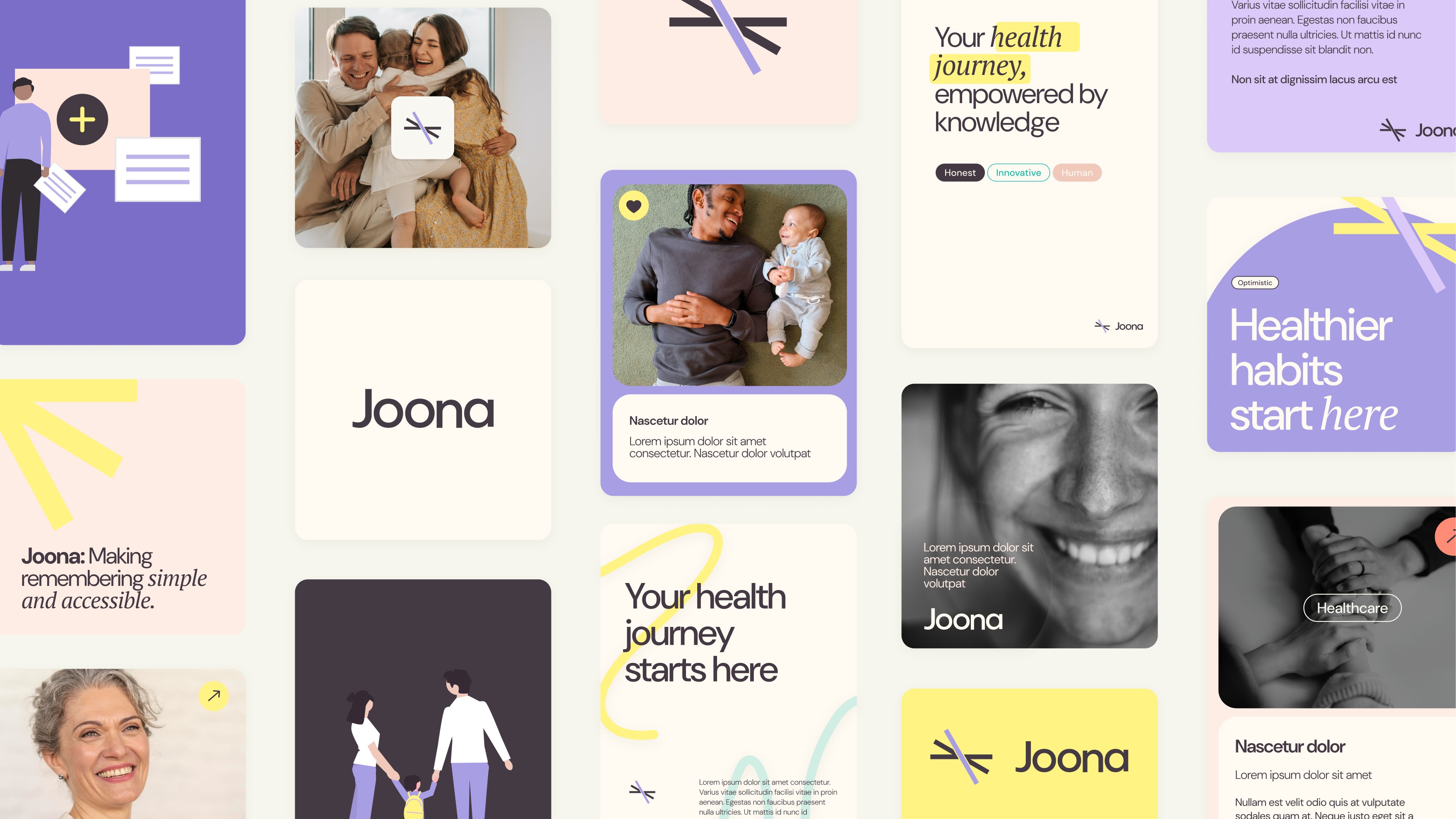
Brand identity: typography, colour, illustration, and tone of voice
Outcome
Joona shipped as a clean, secure application that gives users real ownership of their health information. It's built to grow.
Comprehensive health tracking, clear privacy communication, and a system that stays approachable for everyday people. That was the brief, and that's what got built.
- Full symptom and health tracking system
- Multi-profile support with premium tracking features
- Security and privacy communicated without jargon
- Architecture ready to expand with new health management tools
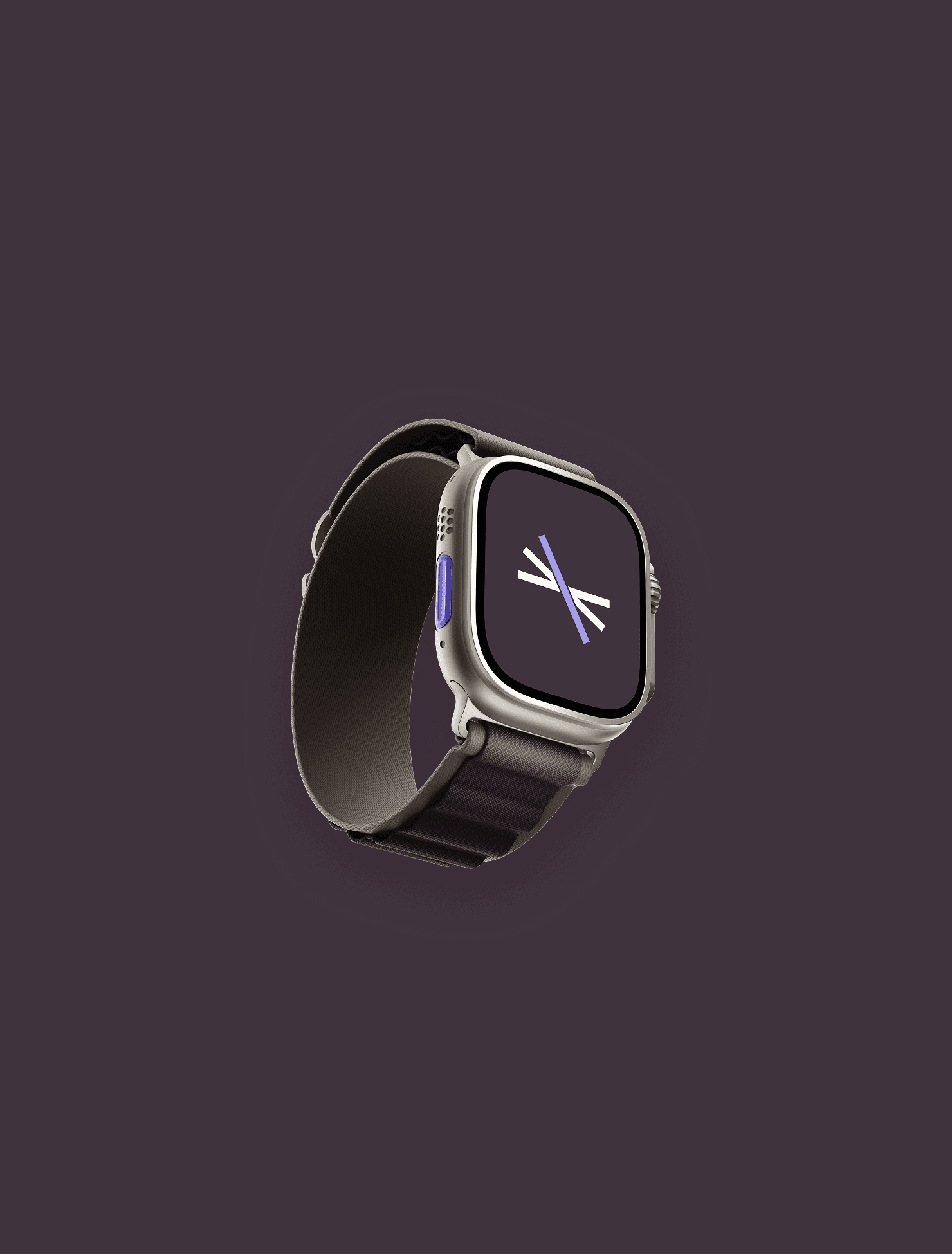
Joona on Apple Watch: health tracking on the wrist
Joona Logo Anatomy
A health companion people can trust: clear, secure, and built around the user's need for control and independence.